
Mood and Emotion Using Color in Painting are essential tools for every artist. Learning how to create mood and emotion using color allows painters to guide the viewer’s feelings, making artwork more engaging and impactful. Color, its intensity, harmony, and contrast can completely transform a painting’s emotional tone.
From warm, uplifting tones to cool, melancholic shades, understanding Mood and Emotion in Painting helps artists communicate depth, atmosphere, and story through every brushstroke. In this guide, we’ll explore the science of color, practical painting techniques, and strategies to evoke mood effectively.
Understanding Color and Emotion
Colors are not just visual; they carry emotional weight. Our brains associate certain colors with feelings and reactions. When learning Mood and Emotion in Painting, understanding these associations is crucial.
Emotional Associations of Common Colors
| Color | Mood/Emotion |
|---|---|
| Red | Passion, anger, energy |
| Blue | Calm, sadness, serenity |
| Yellow | Happiness, optimism, warmth |
| Green | Growth, tranquility, envy |
| Purple | Mystery, luxury, spirituality |
| Orange | Excitement, creativity, warmth |
| Black | Power, sorrow, mystery |
| White | Purity, simplicity, peace |
Color Temperature and Mood
Color temperature significantly influences mood. Warm colors (reds, yellows, oranges) tend to energize, while cool colors (blues, greens, purples) calm or create distance.
Tips for Using Color Temperature
- Warm tones for excitement, intimacy, or focus
- Cool tones for calmness, sadness, or isolation
- Mixing warm and cool tones for tension or balance
- Adjusting brightness and saturation to control intensity
- Using dominant color schemes to establish the primary mood

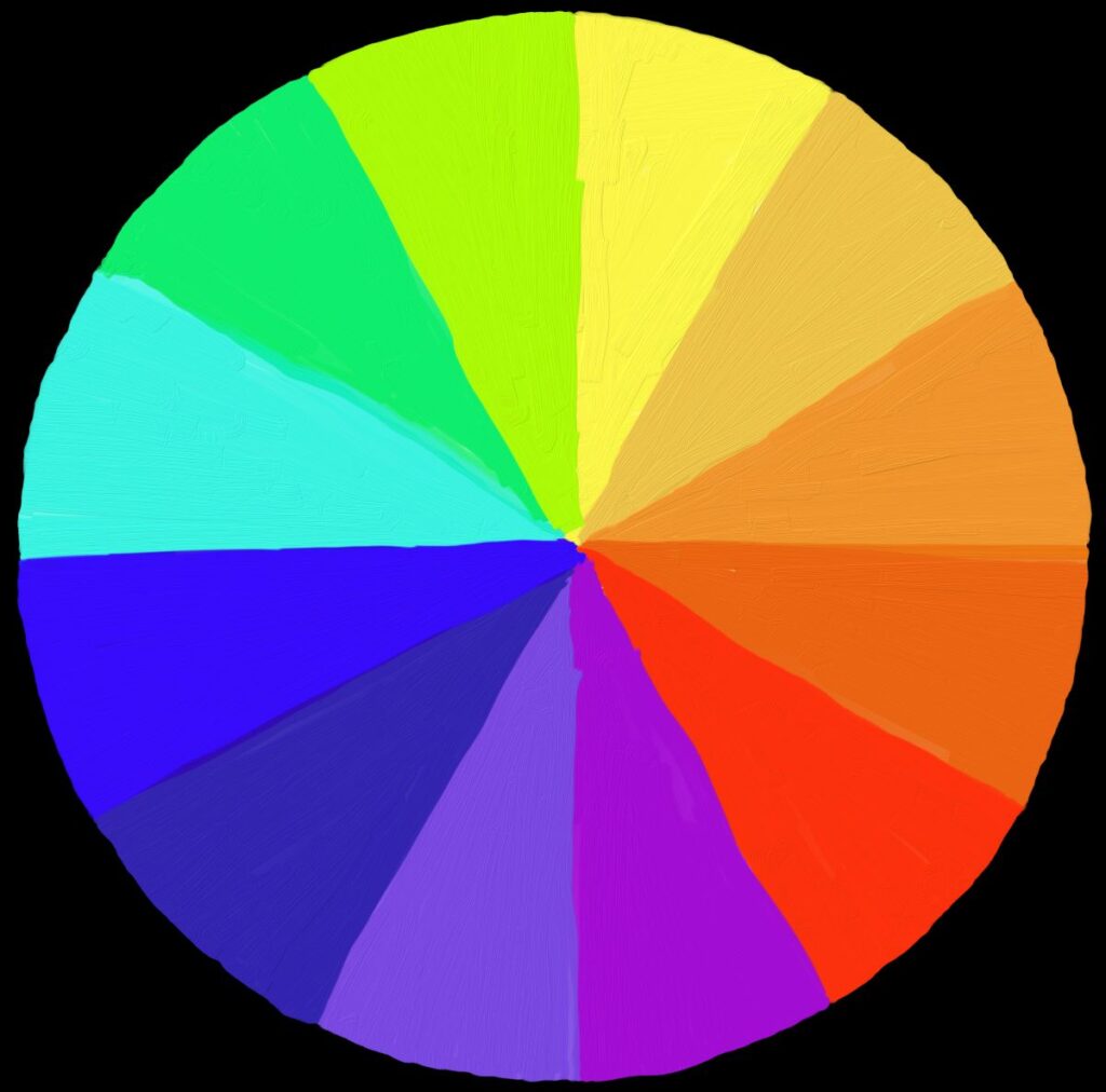
Complementary Colors and Emotional Contrast
Complementary colors are opposite on the color wheel and create strong visual contrast. Using them thoughtfully in painting can enhance mood and emotional tension.
How to Use Complementary Colors
- Red and green: energy and balance
- Blue and orange: vibrancy and focus
- Yellow and purple: contrast and drama
Color Harmony Table for Mood
| Color Pair | Mood Effect |
|---|---|
| Red + Green | Dynamic tension |
| Blue + Orange | Visual excitement |
| Yellow + Purple | Playfulness or drama |
Saturation and Brightness for Mood
Saturation and brightness play a huge role in how color affects mood in painting.
- High saturation: vibrant, lively, energetic
- Low saturation: muted, calm, melancholic
- High brightness: uplifting, lighthearted
- Low brightness: somber, dramatic
Adjusting saturation and brightness helps refine Mood and Emotion in Painting even with the same color palette.
Using Color Schemes to Evoke Emotion
Color schemes can unify a painting and evoke specific emotional responses.
Common Color Schemes and Their Mood Effects
| Color Scheme | Description | Mood/Emotion |
|---|---|---|
| Monochromatic | Variations of a single color | Calm, cohesive, introspective |
| Analogous | Neighboring colors on the wheel | Harmony, comfort, natural feel |
| Complementary | Opposite colors | Contrast, drama, energy |
| Triadic | Three colors evenly spaced | Vibrancy, playfulness |
| Split-complementary | One color + two adjacent to complement | Balanced contrast with visual interest |
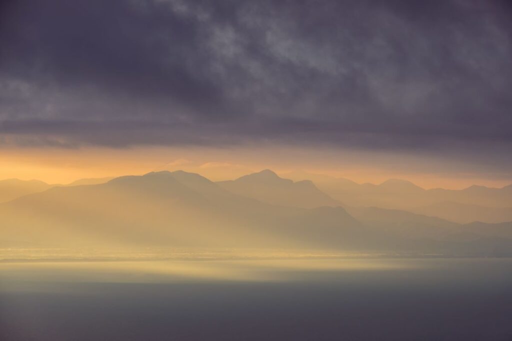
Using Color in Landscapes to Convey Mood
Landscape painting provides a natural canvas for evoking mood through color. The time of day, weather, and season all influence color choices.
Tips for Landscape Painting
- Sunrise/Sunset: Warm tones like reds, oranges, and pinks evoke calm, romantic, or uplifting moods.
- Overcast Day: Cool blues and greys create melancholy, quiet, or reflective atmospheres.
- Seasonal Influence: Autumn tones (orange, red, brown) convey warmth and nostalgia, while winter tones (white, blue, muted colors) evoke stillness and isolation.
- Foreground vs Background: Use warmer, more saturated colors in the foreground to attract attention, and cooler, desaturated colors in the background to create depth.
Creating Emotion in Portraits Through Color
Portraits are one of the most expressive ways to apply Mood and Emotion in Painting. Color affects how viewers interpret personality, emotion, and context.
Key Techniques
- Skin Tones: Slight warmth in highlights conveys vitality; cooler shadows can express introspection or sadness.
- Background Colors: Warm backgrounds suggest energy or intimacy; cool backgrounds emphasize distance or calm.
- Clothing & Accessories: Colors worn by the subject reinforce the emotional tone of the portrait.
Portrait Color Guide Table
| Color Usage | Emotion |
|---|---|
| Warm highlights | Energy, optimism, friendliness |
| Cool shadows | Thoughtfulness, sadness, mystery |
| Vibrant clothing | Confidence, creativity |
| Muted clothing | Subtlety, restraint, melancholy |
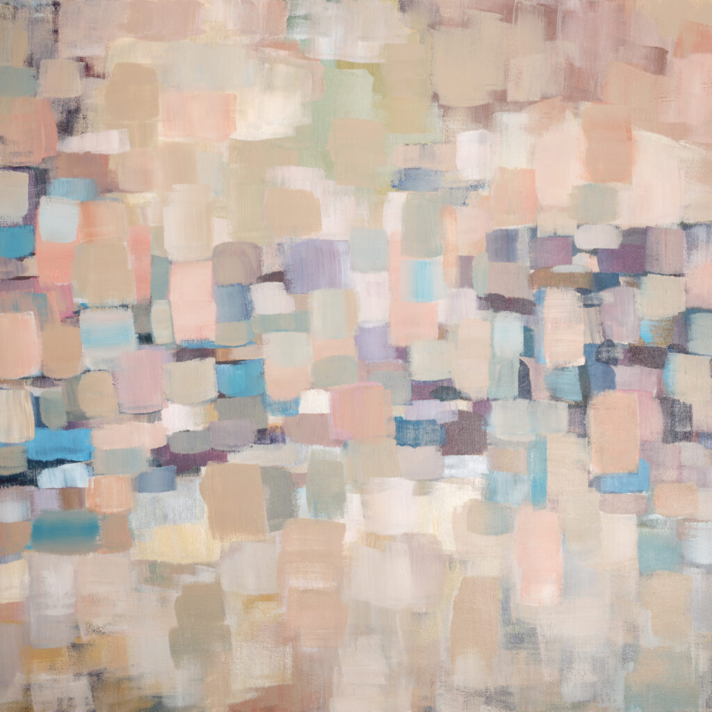
Applying Color in Abstract Painting for Mood
In abstract painting, color often becomes the primary tool for emotion. Shapes and forms may take a secondary role.
Tips for Abstract Work
- Choose a dominant color to establish the main mood.
- Use contrasts and complementary colors for tension and excitement.
- Experiment with saturation and transparency to add emotional depth.
- Layer multiple colors to create complex feelings.
Layering and Glazing Techniques
Layering and glazing allow painters to build emotional depth by controlling transparency, light, and color interaction.
Practical Steps
- Start with a base layer that establishes the mood.
- Apply thin glazes to adjust temperature and tone.
- Use multiple layers to achieve subtle transitions and luminosity.
- Step back frequently to evaluate the emotional impact.
Psychological Tips for Choosing Color Intuitively
Sometimes intuition guides color choice better than strict rules.
- Observe your emotional response to colors before painting.
- Use personal associations: Colors that resonate with your feelings will often convey emotion better.
- Experiment with unusual combinations: Unexpected palettes can surprise and engage viewers.
- Trust contrast: Emotional impact often comes from light vs dark or warm vs cool contrast.
Conclusion: Mastering Mood and Emotion in Painting
Creating Mood and Emotion in Painting is about understanding the language of color and how it interacts with the viewer’s psychology. Every choice—from hue to saturation, from contrast to layering—affects how a painting is perceived.
Whether you are painting a serene landscape, an expressive portrait, or a bold abstract work, color allows you to convey energy, calm, tension, sadness, or joy. Mastering this skill requires both technical understanding and intuitive practice. By studying color theory, observing the world, and experimenting with palettes, every artist can evoke profound emotions through their work.
The emotional resonance of your painting is what makes it memorable. As you continue to experiment with color, remember that painting mood and emotion is not just about replicating reality—it’s about interpreting it in a way that connects with your audience on a deep emotional level.
What is Mood and Emotion in Painting
Mood and Emotion in Painting refers to the use of color, contrast, and light to convey feelings and emotional tone in artwork.
How can I create emotion using color
Use color temperature, saturation, brightness, and complementary color schemes to evoke specific moods such as calm, excitement, sadness, or warmth.
What colors evoke happiness or sadness in painting
Warm colors like yellow, orange, and pink often convey happiness and energy, while cool colors like blue and grey evoke calmness or sadness.
Can abstract paintings convey mood without realistic imagery
Yes, in abstract painting, color and composition alone can communicate mood and emotional intensity effectively.
How do layering and glazing enhance emotional depth
Layering allows subtle shifts in tone and hue, while glazing controls transparency and color intensity, adding complexity to the mood.
Where can beginners learn more about painting mood
Beginners can explore color theory guides, painting tutorials, and emotional color exercises. For a deeper dive into painting styles and expression, see this internal guide:
https://paintersdiary.com/art-style-as-a-beginner/
Are there advanced resources for creating mood with color
Yes, for advanced techniques, color psychology, and professional tutorials, check out this external resource:
https://www.artistsnetwork.com/art-techniques/color-psychology-in-painting/