

Color Psychology plays a crucial role in how we perceive the world around us, influencing emotions and perceptions often without our conscious awareness. For centuries, artists have harnessed this power to connect deeply with their audience, evoking specific feelings and shaping the experience of their work. From the calm of serene blues to the passion ignited by fiery reds, color has a profound impact on how we engage with art.
This blog will explore the fascinating intersection of art and psychology, revealing how colors stir emotions, tell stories, and leave lasting impressions. Whether you’re an art enthusiast, a creative professional, or a psychology student eager to learn the hidden language of color, you’ll find plenty of inspiration and insights here!
Understanding Color Psychology
Color psychology focuses on how hues affect human behavior and emotional states. While individual responses to color can be subjective, there are common associations that resonate universally. Understanding these psychological effects can help artists intentionally convey emotions.
Common Color Associations
- Red – Passion, power, energy, and sometimes aggression. Red commands attention and evokes a sense of urgency.
- Blue – Calmness, stability, and trust. It’s often associated with peace and introspection, but darker blues can evoke a sense of melancholy.
- Yellow – Happiness, warmth, and optimism. Used excessively, however, it may come across as overwhelming or harsh.
- Green – Growth, harmony, and balance. Green conveys nature and renewal, but certain shades can represent greed or envy.
- Purple – Luxury, spirituality, and creativity. Often linked to depth and wisdom, purple can evoke a mysterious or regal tone.
- Black – Sophistication, mystery, and power, but also associated with sadness or fear.
- White – Purity, simplicity, and cleanliness. White often invokes clarity or peace but may feel sterile in excess.
“Colors are the smiles of nature,” observed Leigh Hunt. But beyond their aesthetic appeal, they tap into our subconscious, making them a powerful tool for artists.

The Role of Color in Art
Artists use color to evoke specific emotions, guide the viewer’s eye, and articulate themes or narratives. The right palette can set the mood and make a powerful statement without a single word being spoken.
Setting the Mood
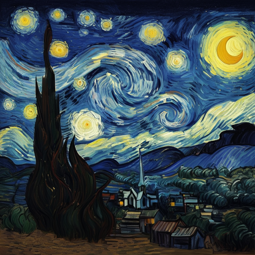
Take Vincent van Gogh’s Starry Night as an example. The swirling blues of the nighttime sky, punctuated by bright yellow stars, create a scene that is both tranquil and dynamic. Blue conveys introspection and melancholy, while yellow provides hope and vibrancy, balancing the emotional intensity of the painting.
“Kandinsky believed color was a direct line to the soul,” explains Dr. Ellen Winner, a psychologist specializing in the psychology of art. Indeed, Wassily Kandinsky, a pioneer of abstract art, perceived colors as having both a spiritual and emotional dimension. He argued, for example, that yellow could evoke the sound of trumpets, joyful and loud, while blue mirrored the calming hum of a cello.
Creating Narrative
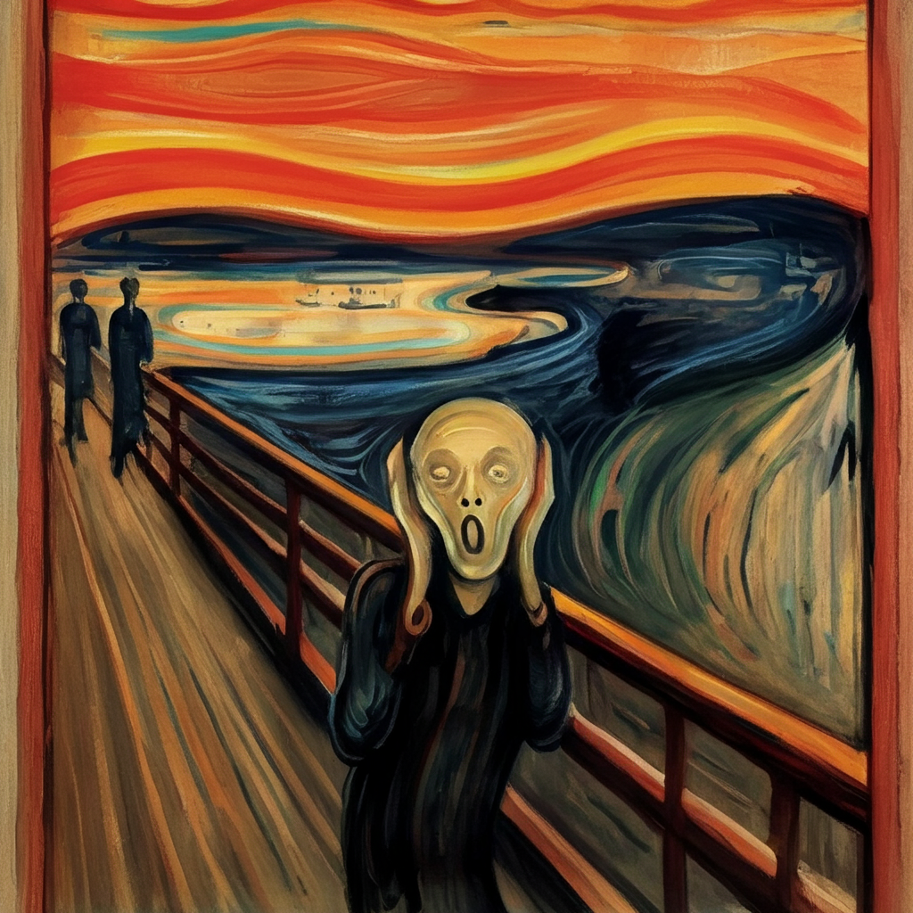
Color combinations can serve an essential role in storytelling. Consider Edvard Munch’s The Scream, where jagged streaks of red and orange dominate the sky, evoking a visceral sense of dread and turmoil. The dramatic hues encapsulate the raw human emotion painted into the scene—fear, anxiety, and despair.
Likewise, Van Gogh’s Starry Night uses swirling blues and yellows to create a sense of wonder and movement, pulling the viewer into a dreamlike state. The interplay of these colors conveys both the beauty and chaos of the night, suggesting that even in darkness, there is an underlying vibrancy and life. Through such deliberate choices, artists use color not only to depict scenes but to weave emotional and psychological threads that guide the audience through the story embedded within the artwork.
Guiding the Viewer’s Eye
Artists guide their audiences by strategically placing bold colors. For instance, in Botticelli’s The Birth of Venus, the use of soft pastels and gentle contrasts directs the viewer’s focus toward Venus herself, emphasizing her grace and divinity.
Case Studies in Color Psychology
Famous artworks give us powerful examples of how artists utilize color psychology to deepen emotional impact.
1. The Scream by Edvard Munch
The chaotic waves of red, orange, and yellow assault the viewer’s senses while simultaneously reflecting the turmoil within the figure. Munch described this moment as “an infinite scream passing through nature,” a perfect embodiment of color amplifying emotion.
2. Starry Night by Vincent van Gogh
The blend of cool blues and energetic yellows creates a dreamlike yet grounded experience. It evokes reflection on the loneliness and beauty of the night, resonating deeply with the human condition.
3. The Birth of Venus by Sandro Botticelli
The soft pinks, natural greens, and ocean blues generate an ethereal, calm atmosphere. This use of color enhances the feeling of Venus as a divine, otherworldly figure—beauty emerging from chaos.
4. Composition VII by Wassily Kandinsky
This abstract masterpiece utilizes a cacophony of colors such as vibrant reds, blues, and yellows interwoven with darker tones to evoke a sense of motion and emotion. The chaotic yet harmonious color use reflects Kandinsky’s belief in the psychological power of colors to transcend visual experience and directly influence human feelings and spirituality.
5. The Persistence of Memory by Salvador Dalí
Dalí’s use of muted yellows and browns, contrasted with sharp blues and whites, establishes an unsettling, surreal mood. The color palette accentuates the dreamlike quality of the melting clocks, which challenges perceptions of time and reality, influencing viewers to explore themes of memory and existence.
Practical Applications for Artists and Designers
How can you harness the emotional power of color in your own creative work? Here are practical tips for making color psychology work for you:
1. Choose an Emotional Palette
Before you begin your artwork, ask yourself—what emotion do you want to evoke? For calmness, lean on cool tones like blues and greens. If you want to energize or surprise your audience, consider bold reds or yellows.
2. Understand Context
Colors carry cultural and contextual meanings. For example, white symbolizes purity in Western cultures but represents mourning in others. Keep your audience’s background in mind when choosing your palette.
3. Experiment with Contrast
Contrast can create drama and direct the eye to focal points within your composition. High contrast—like pairing black and gold—can exude luxury, while subtle tonal differences suggest softness or harmony.
4. Use Tasting Notes
Much like tasting profiles in wine or coffee, think of colors like flavors. How does one “taste” or “feel”? For instance, pairing earthy greens with golden browns can evoke the richness of nature, while neon tones hint at modernity and youthfulness.
5. Learn from Masters
Study how legendary artists infuse color into their work. David Hockney once said, “Colors are brighter when the mind is open.” His vibrant vistas are an excellent example of how color can evoke both nostalgia and energy.
Why Color Psychology Matters Beyond Art
The power of color psychology isn’t limited to just fine art. Commercial industries—from marketing campaigns to branding and product design—leverage emotional triggers rooted in color. As Leatrice Eiseman of the Pantone Color Institute explains, “What we feel in response to color often translates into action, whether it’s purchasing a product or engaging with an idea.”
For designers, psychologists, and creatives alike, understanding color is more than an art—it’s a science and a tool for connection.
Explore the Emotional Palette
From sparking joy to instilling fear, color is the universal language of emotion. By understanding the principles of color psychology—and looking to iconic artists for inspiration—you can create compelling, meaningful work that resonates deeply with your audience.
Take a moment to revisit your favorite artwork. What emotions leap out? Which colors contribute to those feelings? Then share your thoughts or your own experiences working with color in the comments. We’d love to hear how you’ve explored this vibrant and impactful dimension of art.
FAQs
What is color psychology?
Color psychology is the study of how colors influence human behavior, emotions, and decisions. It explores the deep-rooted psychological and cultural connections we have with specific colors and how they can evoke distinct feelings or reactions.
How do colors affect branding and design?
Colors play a critical role in branding and design by evoking certain emotions and shaping perceptions. For example, blue often conveys trust and stability, while red may evoke excitement or urgency. Choosing the right color palette can enhance a brand’s identity and influence consumer behavior.
Can color meanings vary across cultures?
Yes, the meaning of colors can differ significantly across cultures. For instance, white is associated with purity and weddings in Western cultures, but it may symbolize mourning in some Eastern traditions. It’s important for designers and marketers to consider cultural contexts when working with color.
How do I choose the right colors for my project?
Start by defining the emotions or messages you want to convey. Consider the target audience, cultural context, and the industry standards. Experiment with different combinations and test their impact to find the perfect match for your work.
What tools can I use to explore color combinations?
There are numerous tools available, such as Adobe Color, Canva’s Color Palette Generator, and Coolors. These platforms allow you to experiment with palettes, explore harmonious combinations, and even extract colors from images for inspiration.