

Depth in Art is a powerful technique that brings dimension and space to a painting, creating a sense that you could step right into it. It’s not just a matter of realism—depth makes paintings more engaging, immersive, and visually dynamic.
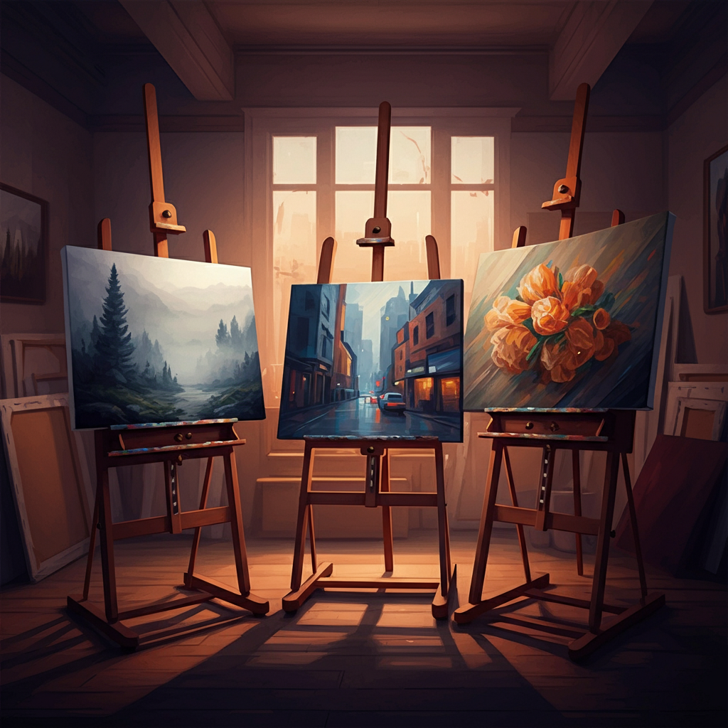
But here’s the good news—creating depth in your artwork doesn’t have to be complicated. With just a few simple techniques, you can transform your work from flat to fascinating. This beginner-friendly guide breaks down seven easy methods for adding depth to your paintings and bringing them to life.
Why Depth in Art is Important?
Depth is an essential element that allows your art to feel more lifelike and multidimensional. When you create the illusion of space in two-dimensional art, you invite the viewer to move through your composition, making the experience more immersive. Whether you’re painting landscapes, portraits, or even abstract work, incorporating depth enriches storytelling and strengthens emotional connections to the piece.
Think about classic works like Leonardo da Vinci’s The Last Supper or the atmospheric landscapes of J.M.W. Turner. Depth is the magic that pulls the viewer into these masterpieces. You can create that same magic with the right techniques.
7 Easy Techniques for Creating Depth in Your Paintings
1. Atmospheric Perspective
Atmospheric perspective uses changes in color, clarity, and contrast to mimic how objects appear at varying distances in the natural world.
How it works:
- Objects closer to the viewer are painted with sharp details and saturated colors.
- Distant objects, like mountains or trees, appear lighter, hazier, and less defined.
- Warm colors like reds and oranges are typically used for foreground elements, while cooler colors like blues and greens are reserved for the background to enhance the sense of depth.
- Gradual transitions in tone and value between foreground and background elements help create a seamless and realistic effect.
- Overlapping objects can also be used, with those in the foreground partially obscuring those further away to establish a sense of hierarchy in distance.
Tip: For landscapes, gradually reduce contrast and detail as the distance increases. Adding a blue or gray tint to objects far away can replicate the effect of atmospheric haze.
Example: Artist A’s landscape paintings masterfully use atmospheric perspective. By gradually softening colors and reducing detail on distant hills, they create breathtaking depth that draws the viewer in.
2. Overlapping Shapes
Overlapping is one of the simplest ways to create depth. When one object partially obscures another, it suggests that the front object is closer to the viewer.
How it works:
- Use lighter and cooler colors for objects in the background to mimic the natural effect of atmospheric haze.
- Reduce the sharpness and detail of objects as they recede into the distance.
- Gradually transition contrasts and tones to give a sense of fading light and depth.
Tip: Avoid placing every object side by side—this can make your composition feel flat. Instead, experiment with layering your subjects.
Case Study: Painter B’s architectural works are an excellent example of using overlapping. By painting foreground buildings that overlap those in the background, their pieces achieve remarkable realism.
3. Size and Scale
Objects appear smaller as they recede into the distance and larger as they come closer to the viewer.
How it works:
- Alter the size of your subjects based on their position within the composition.
- Combine varied sizes to emphasize depth.
- Use careful measurements to ensure proportional accuracy between foreground and background elements.
- Experiment with exaggerated scaling for creative or dramatic effects, but maintain a sense of spatial realism whenever necessary.
- Pay attention to the relationship between the horizon line and object size to anchor the viewer’s perspective effectively.
Pro Tip: Remember perspective rules when sizing objects, especially in still life or cityscape settings.
Example: Artist C leverages size and scale in their still life paintings by depicting items like fruit, which decrease proportionally the farther they “sit” on a table, giving the work a lifelike quality.
4. Linear Perspective
Linear perspective uses angled lines (also called orthogonal lines) that converge on one or more vanishing points. This technique is particularly effective for architectural and landscape scenes.
How it works:
- Identify your vanishing point(s) on the horizon line.
- All lines in your composition converge toward these points, creating the illusion of space and distance.
- Use a ruler or straightedge to draw precise and clean lines converging toward the vanishing point(s).
- Start with the larger, foreground elements, and progressively scale objects down as they get closer to the vanishing point to enhance the depth effect.
- Pay attention to proportions and spacing to ensure objects align naturally within the perspective grid.
- Experiment with multiple vanishing points for more dynamic and complex compositions, such as in two-point or three-point perspectives.
Practical Tip: Start by practicing one-point perspective (all lines converge to a single point) before moving on to more complex two- or three-point perspective techniques.
Case Study: Painter B incorporates linear perspective beautifully. Their cityscapes feature streets and buildings that lead the eye directly into the painting, creating a sense of depth and grandeur.
5. Value and Contrast
Value refers to the lightness or darkness of a color. Using high contrast in the foreground and soft values in the background can establish depth.
How it works:
- Bright highlights and stark shadows often appear in areas closer to the viewer.
- Subdued tones and minimal contrast are best for distant planes.
- Sharp edges and defined details are more pronounced in the foreground, while softer edges and less detail help push objects into the background.
- Warmer colors tend to advance towards the viewer, while cooler colors recede, helping to create a three-dimensional effect.
- Gradual transitions between light and shadow, known as atmospheric perspective, mimic the way objects appear in the natural world, enhancing depth and realism.
Tip: Experiment with gradients to show a gradual transition from light to dark in elements like skies.
Example: Artist C’s still life paintings demonstrate how value adds three-dimensionality, with light and shadow highlighting the contours of their subjects.
6. Color Theory
Colors alone can create the illusion of depth. Warm colors (reds, oranges, yellows) seem to come forward, while cool colors (blues, greens) recede.
How it works:
- Use warm tones for foreground elements.
- Reserve cool, muted colors for backgrounds.
Tip: Overusing bold, saturated colors throughout a piece can flatten your composition. Balance is key!
Case Study: Artist A skillfully applies color theory in their atmospheric landscapes. Warm sunsets on the horizon contrast beautifully with the cool tones of distant mountains.
7. Focal Points and Suggested Lines
Focal points draw the viewer’s attention immediately to specific areas, while suggested lines guide the eyes through the composition.
How it works:
- Use light, shadow, and detail to emphasize focal points.
- Suggested lines (like a winding road or the branches of a tree) direct the viewer’s gaze across the painting.
Pro Tip: Don’t overfill your canvas with competing focal points—they can confuse the viewer.
Example: Artist D’s portraits effectively use focal points by emphasizing the subject’s eyes with dynamic contrast and subtle suggested lines in the background to lead the viewer further around the piece.
Combining These Techniques
While each of these techniques is powerful on its own, combining them can take your work to the next level. For instance, in landscape paintings, you could use atmospheric perspective for distant mountains, linear perspective for a winding path, and color theory to create contrast between foreground and background elements.
It’s essential to practice layering these techniques. Start small—sketch studies that incorporate two or three methods—and gradually work your way up to more complex compositions.
Make Depth a Habit in Your Art
Depth isn’t just a technique; it’s a mindset. Consistently using these tools in your artwork will help you refine your skills and create more powerful, engaging pieces over time. Don’t be afraid to experiment and learn from your mistakes.
Want feedback or advice on your latest painting? Share your work with us! Our community of artists is here to inspire and guide you on your artistic journey.
FAQs
Q: How can I improve my understanding of depth in art?
A: Practice is key! Start by studying examples in famous artworks and try sketching simple scenes to apply techniques like perspective and shading. Layering different methods, such as atmospheric perspective alongside color theory, can also help to enhance depth in your pieces.
Q: What materials are best for practicing depth techniques?
A: Basic materials like pencils, sketch paper, and an eraser are great for getting started. Once comfortable, you can experiment with paints, digital tools, or mixed media to explore how different textures and colors contribute to depth.
Q: How do I know if I’m using depth techniques correctly?
A: Step back and evaluate your work as a whole. Ask yourself if the composition feels dimensional and if objects appear appropriately positioned in space. Sharing your artwork with others for constructive feedback can also be invaluable.
Q: Is it possible to overdo depth in a piece?
A: Balance is crucial in art. Too many competing techniques or exaggerated effects can make a piece feel cluttered. Use depth strategically to guide the viewer’s eye and maintain harmony in your composition.
Looking for more tips or have additional questions? Reach out to our community for personalized advice!